Luminary Homepage
“Users weren't sure what they were paying for. The page didn't answer the question before asking for a credit card.”
Lead Product Designer
Luminary
2019–2020
Growth Design · Research-Driven · Conversion Optimization
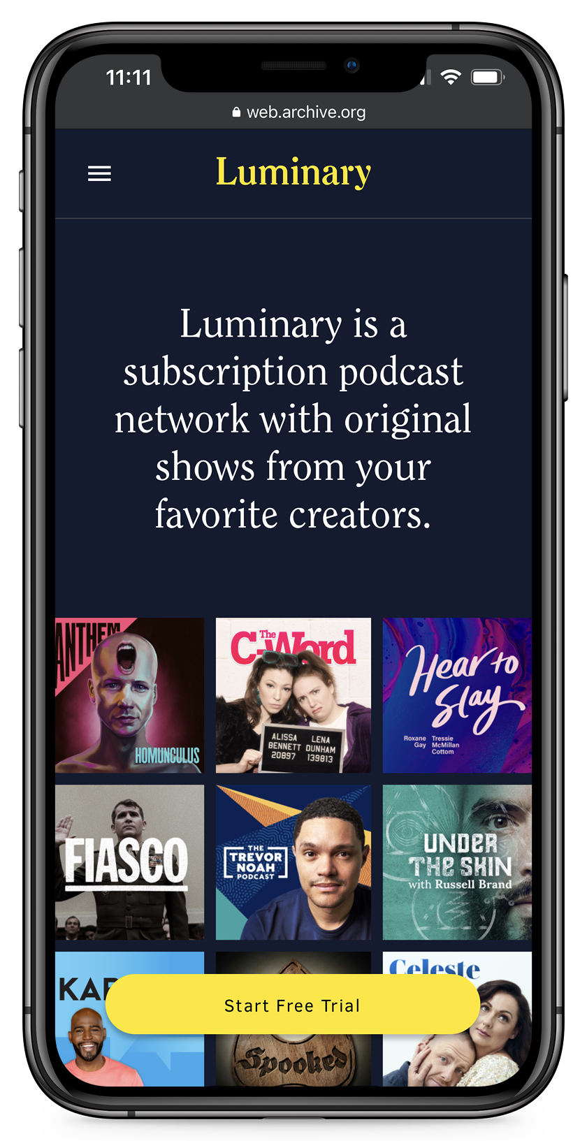
Luminary's homepage was optimized for content discovery, not conversion. Users who intended to sign up were abandoning — going to the Originals page to find out what shows were available, then re-entering the sign-up flow confused or not returning at all. The page was asking for trust before it had earned it.
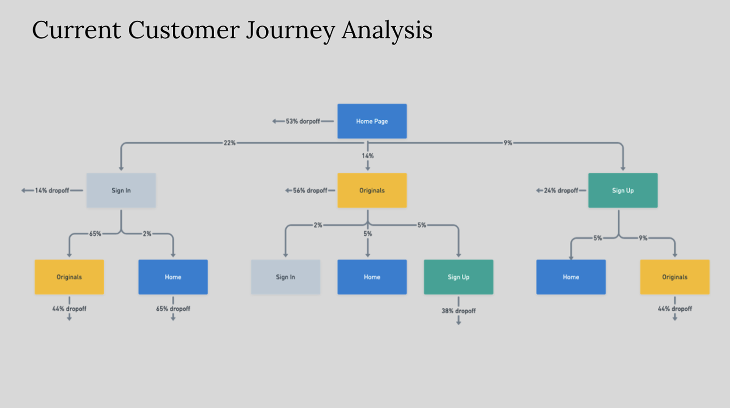
Journey analysis
Mapped the actual user flows using Google Analytics. Key finding: 53% dropoff from the homepage, significant traffic to Originals page before sign-up attempts.
Content audit
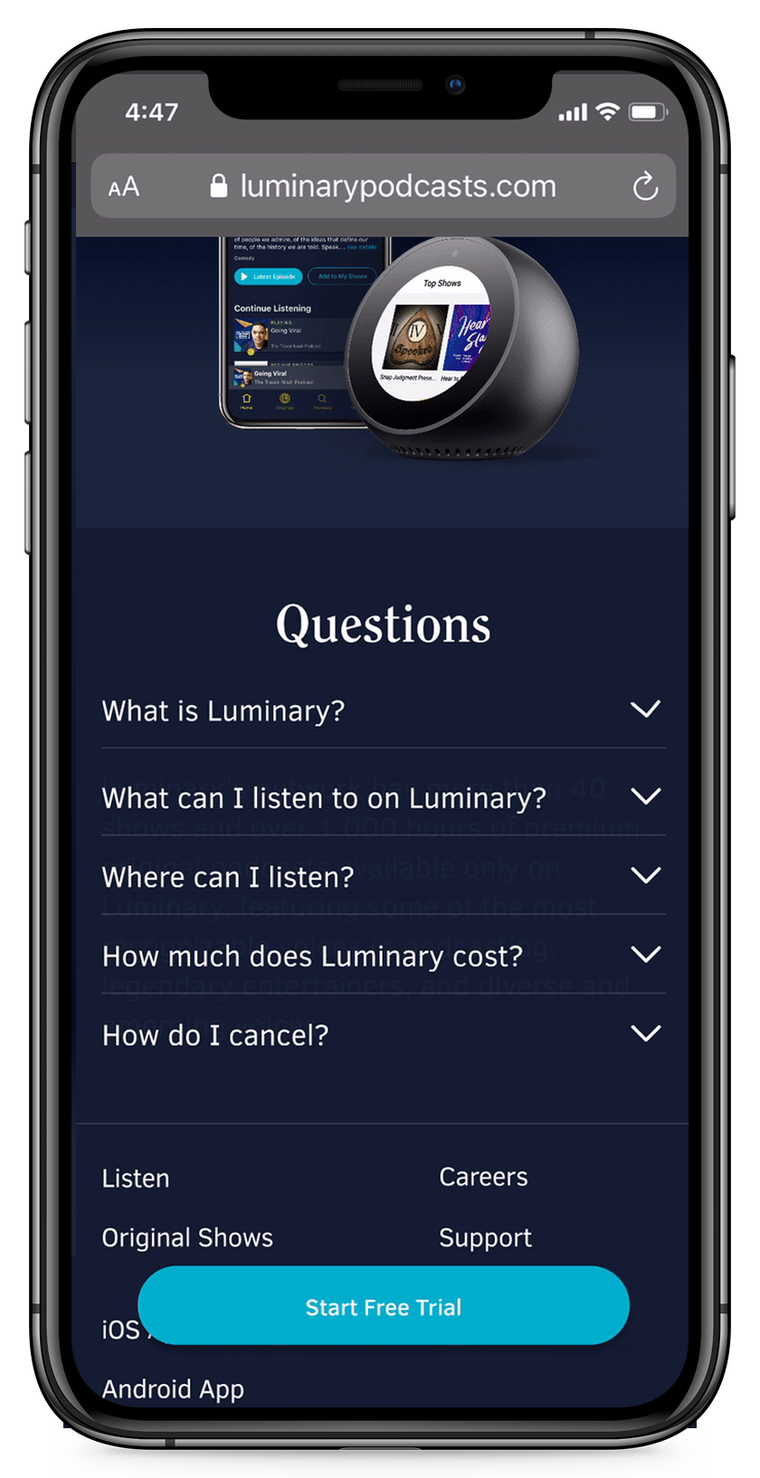
Audited what information users were seeking before converting — show library breadth, creator credibility, pricing clarity, cancellation terms. Most of it was buried or missing from the homepage entirely.
Redesign
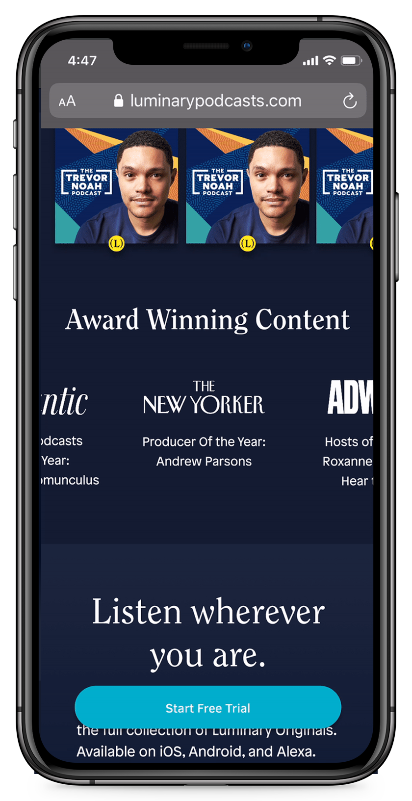
Brought exclusive content, social proof, and clear pricing above the fold — answering the user's questions before they had to go find the answers themselves.
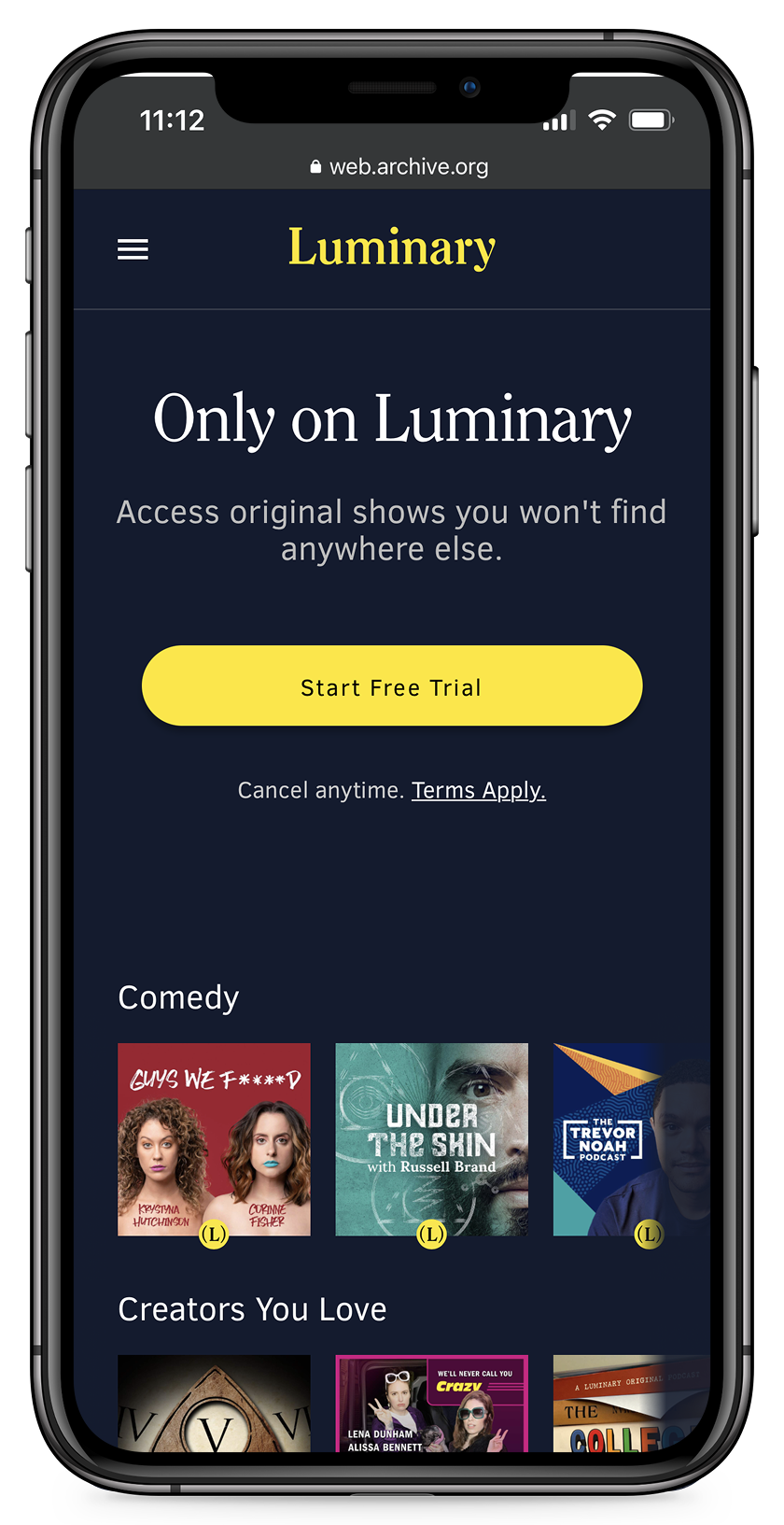
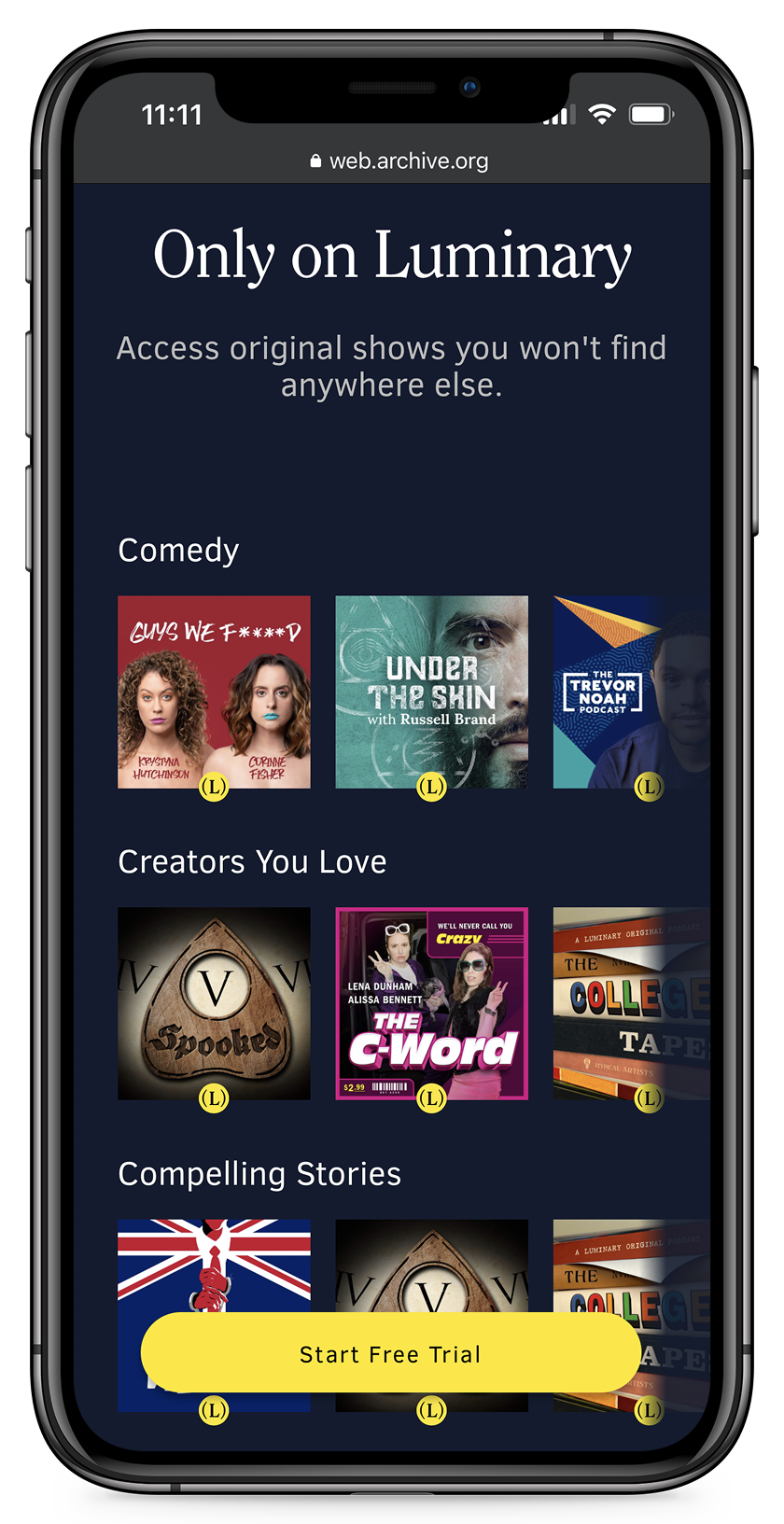
Mobile
Ensured the redesign translated to mobile — where a significant portion of sign-up attempts were happening. The CTA needed to remain visible throughout scroll.
- +0.24% conversion rate improvement on homepage
- +237% total conversions
- -9% dropoff rate from homepage
- -16% pages per session
- 75% free-to-paid conversion rate
- $500K in marketing savings through improved organic conversion